Interior Design Psychology: How Color Affects Productivity
Color paints the world as we know it to be. The hues of life put on their finest outfits for all to see, reflecting the sun, light, and vivid emotion out into the universe. With color, time starts and stops, rolls by rapidly, or drags out for hours. Even so, there’s never quite enough of it, is there? We continue to seek out and grasp hold of color’s limitless possibilities every day of our lives.
Color is integral to design—and those experienced in interior design have spent numerous years learning how to integrate color theory into one’s natural habitats and living interiors. In the past decade, numerous studies have proven the vitality of color within efficient working spaces. Let’s take a closer look at the role color plays in interior design. Here’s what to know about interior design psychology: how color affects productivity.
The Basics: Why Tangible Color Matters
John Ruskin—a writer, educator, critic, and painter who reinvented how humanity sees art—believed that “The purest and most thoughtful minds are those which love color the most.” Colors are undoubtedly compelling facets of nature. The sheer force of their power is inevitable, affecting humankind psychologically, and evoking an individual to feel or act in a certain way by a mere glance.
Every person has a favorite color or two they favor above all. Maybe green reminds you of the plants that once grew at your grandparent's house. Or maybe blue reminds you of a certain hour of time, a past faded away like a sunsetting sky. These colors can change from childhood to adulthood, but your favored hues tell a grand story of how you see and interpret the world.
Color Psychology: Beyond Black-and-White
People innately have an instinctual reaction to certain colors. Even diverse shades kindle up and fully ignite a range of emotions. When it comes to interior design and the raw power color holds in certain spaces, never underestimate emotional influence. Color has a purpose beyond presentation—not to ever be splattered around a room randomly without intention, but as a building block affecting how one thinks, acts, and ultimately feels.
The color of the walls, décor, flooring, natural elements, furnishings, fixtures, and lights all have a hand in the psyche of the space’s inhabitants. If you desire to boost output, inspire creative thinking at home or at work, or promote harmony and balance, you must learn to make good use of colors that can achieve the results that you most strive for.
The Primary Psychological Colors
Within color psychology, four main primary colors influence interior spaces: green, blue, red, and yellow. These benchmark colors were set in stone by the notable developer of The Color Affects System, Angela Wright.
Ever since, psychologists and designers alike have focused deeply on the impact of these foundational hues and their relational patterns. Let’s examine these colors and their fervent psychological effects on the human mind to understand the energy and gravity they interfuse into a room.
Green
Green intrinsically brings the natural world to mind. When you envision green, you may think of the greenest of grasses in deep summertime, a sprawling forest of sequential trees, or succulents lining up on your windowsill. Green is a versatile color of life, calmness, balance, and harmony—unless you’re a shade of green associated with jealousy, illness, or conflict.
Within an interior space, green works wonders to provoke productivity at its most relaxed and resurfacing state. The human psyche tends to associate green with freshness and peace. By soothing the senses, green stimulates increased focus and levels of pure creativity. Green is suitable for any room in a home or office space for boundless thoughts of growth, restoration, and togetherness.
Pro tip: Anytime you’re thinking about using greens, consider how the light will hit. Various shades can become blinding with lots of window space and too much natural light.
Blue
Blue tones are typically tranquil tones associated with serenity. Blue tones are typically tranquil tones associated with serenity. Also linked to the natural world—splendorous oceans and endless cloudless skies—blue is a calming color on the interior design palette.
As possibly the apex color for overall well-being, blue has little to no negative effects on the psyche. Blue eases the mind, slows down heart rate, and reduces blood pressure. For productivity purposes within a set space, shades of blue help stimulate a part of the mind to focus on repetitive tasks or detail-oriented work.
Red
Red is the most vibrant color emitting intense emotion. This generally stimulating color stirs up a sense of immense energy, passion, and urgency within a room. Incorporating a bit of drama and good luck, red represents emotions in their entirety. If productivity is the objective, shades of red combine levels of thrill and vigor. This fusion inspires initiative and willpower throughout a plethora of living and working spaces.
Pro tip: The warmth of the color directs one’s gaze by commanding attention. Use red hues perfectly in subtle accents or decorative items.
Yellow
What color of the world brightens and lifts spirits more than yellow? Yellow is essentially a sunny disposition—a color closely tied to happiness, optimism, intellect, and self-assurance. Best for sparking wonder, energy, and creativity, the color suits countless spaces to produce feelings of warmth, tradition, and triumph. However, do not go overboard with doses of glee for productivity’s sake—you’ll solely induce anxiety or stress by stimulating wayward emotions.
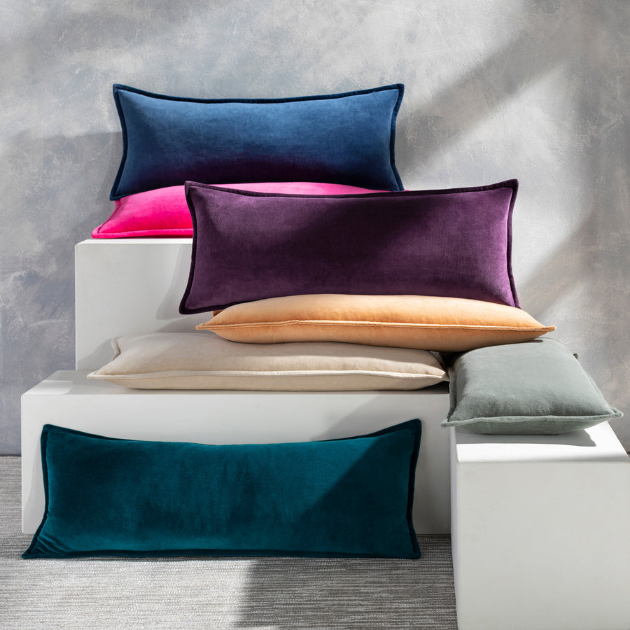
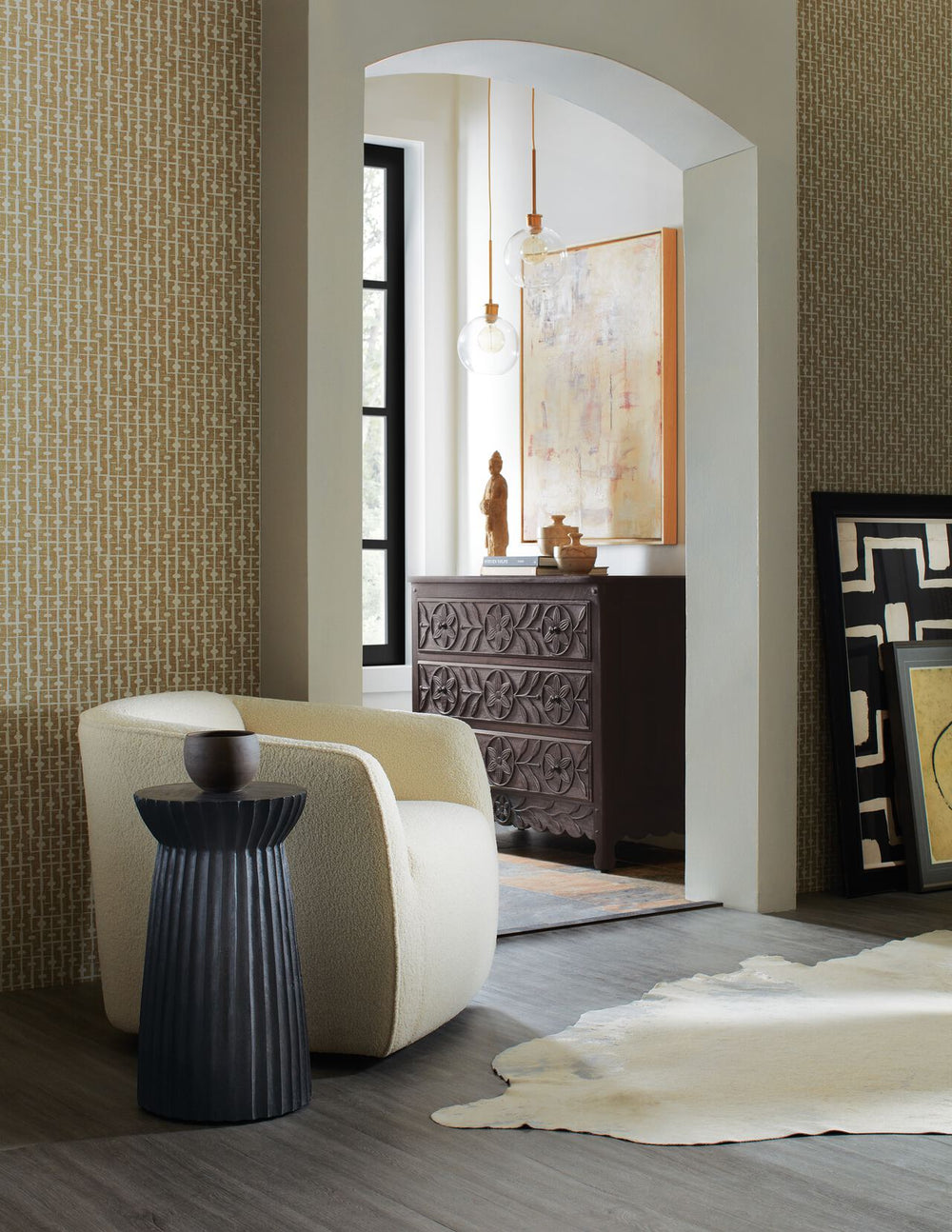
Neutrals and Secondary Colors: Second To None
After considering these primary colors and their unequivocal sway on a room, don’t forget about the opportunities of secondary colors within an interior design palette. Each incorporation of color supports your endeavors to set a room tone and overall mood of a home. Remember that interior design psychology is all about personalization. Besides considering how color affects productivity, you should always choose colors in your home’s living spaces that speak uniquely to you.
Neutrals are leading characters in the story of a modern home. Shades of black, grey, white, and brown are virtuous in design flexibility for aesthetic, function, and room efficiency. The right pairing of neutrals and color hues provides perfect drama, power, and an air of mystery.
Luxury Furnishings and Decors: Color and Character
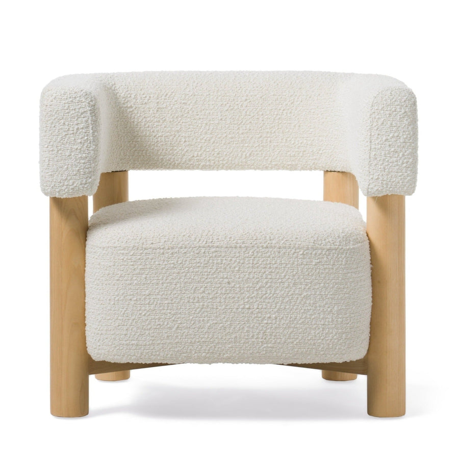
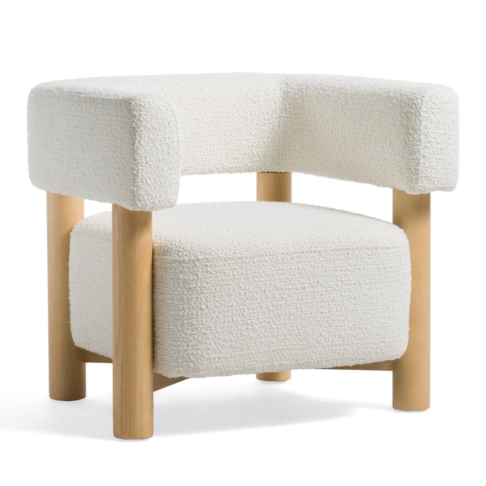
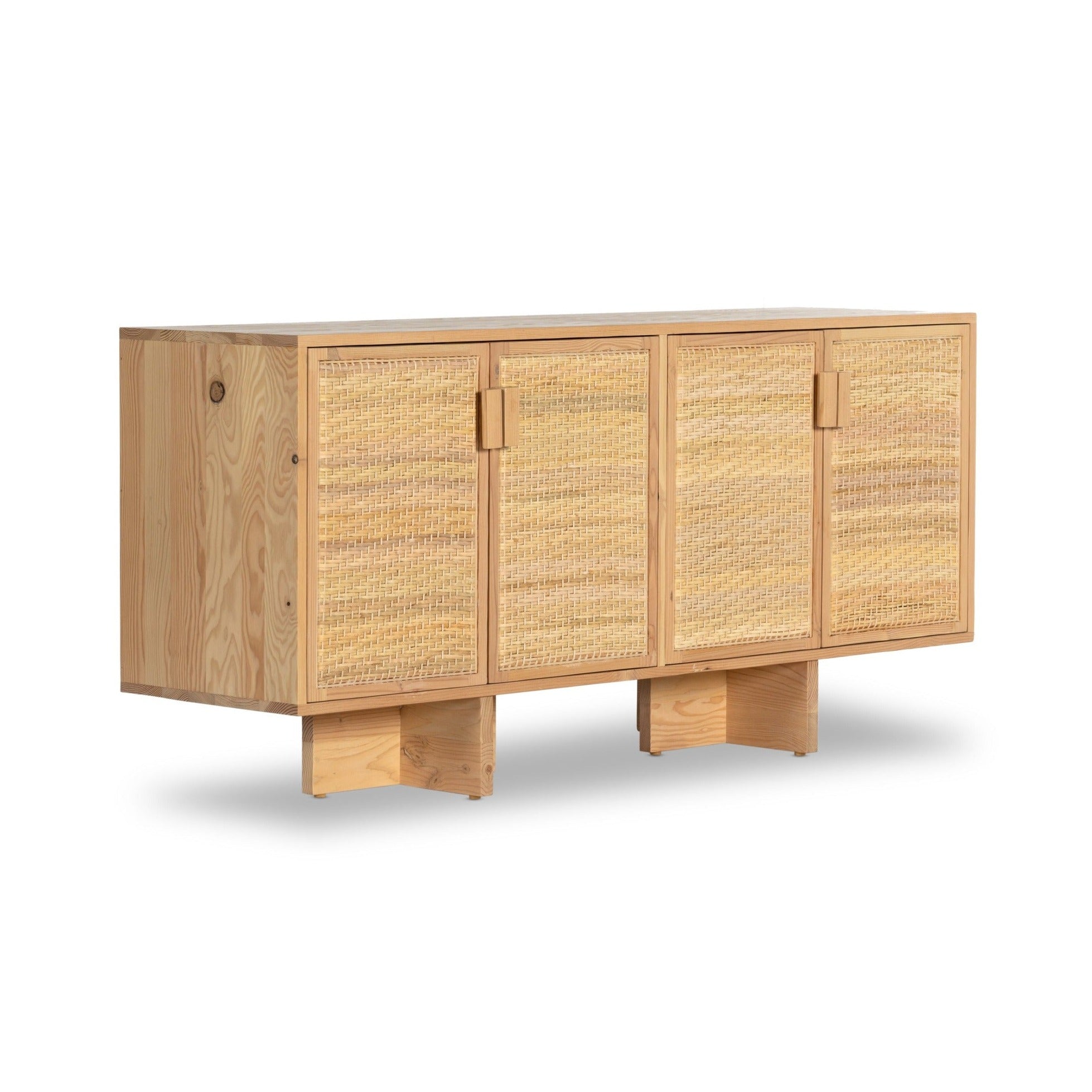
Shop our selection at DesignTap for one-of-a-kind distinctive finds for your interiors. Regardless of your chosen color palette, we have a variety of décor and furnishing styles to suit your taste and preferences. Explore our collections today by browsing our online shop. From a high-end office desk to a lux buffet, here at The Design-Tap, we treasure in-store to help you design a productive and creative space.

Leave a comment